A Behind-the-Scenes Look at Mac Icon Design
Matt Cone February 4, 2007 Tutorials Mac Apple
Several months ago, Macinstruct decided to commission a set of custom-designed icons for its new website. We had no idea what we were doing. After researching the heck out of icon designers and emailing more than a dozen of them, we found somebody we liked who managed to create the beautiful icons you see today on Macinstruct. This article is a crooked chronicle of our experience.
What the @#$%?! Why Mac Icons on a Website?
“Wait a second,” say the old timers. “Icons are for applications, not websites. Why the heck would you want to put those things on Macinstruct?” Well, why not put them on Macinstruct? We love Mac icons, and we wanted to create unique identities for our daily columns. It just made sense to create icons for our columns. They’re instantly recognizable, they make a big impression on people, and we enjoy looking at them. What more could we ask for?
![]()
It all started back around Thanksgiving when we decided to make daily columns part of Macinstruct’s programming. I used all of my Thanksgiving vacation to research icon design and icon designers. Over the next couple days, I emailed more than a dozen designers. That was pretty discouraging, because they were all either expensive, booked solid until next year, or poor artists. But then we found this guy…
The Brains Behind the Brawn
Gary Gehiere is one of the most respected and revered icon designers in the Macintosh icon community. His icon collections have been featured on Apple’s website, and are regularly listed on InterfaceLIFT’s most downloaded Mac icons page. Gary’s personal website and showcase, Pixel Press Icons, regularly runs over its bandwidth allotment at the end of every month - a testament to his quality icons!
When we first contacted him, he told us that he prefers “to craft a few really special icons and make them as beautiful as possible.” This is perhaps the essence of Gary’s work.

The man is always a pleasure to email. You’ll frequently find yourself reading his messages, only to realize that you’ve come across another one of Gary’s insights. He once advised me not to increase the size of the icons too much, because “part of the magic of these icons comes from shrinking them down.” Says Gary:
I started drawing icons in 1996, when I got my first Macintosh. Back then I was a practicing graphic designer in the print industry. Perhaps ironically, the field which first exposed me to Macs hasn’t changed as much as the Mac itself; as the Mac OS has changed so have the skills required to make icons. We rarely work pixel-by-pixel anymore!
Everything I create is an exercise in problem solving. The finished illustration has to meet practical requirements, such as express a concept, metaphor or personal sentiment. And regardless of how super-realistic the finished product will be, it must be broken down and constructed from simple shapes and gradients. Somewhere within those two limitations, a small space for personal expression and technique is usually found, and I can make something that I hope will be a piece of art.
I’m probably not the only adult who still doesn’t know what he wants to do with his life: I still work in the publishing industry, but have moved from desktop publishing over to technical services. In my spare time, I make icons which I share through my website at pixelpressicons.com. To round out my interests, I also have a passion for oil painting and certain stringed instruments.
Gary gave us a good impression right off the bat. We liked the fact that he did icon design on a part-time basis. Since Macinstruct is a volunteer-driven website and we all have full-time jobs, Gary fit right in with the Macinstruct team. We also liked the fact that Gary took his work so seriously. Here was an individual who regarded icon design as an art, not another source of income!
The Road to Pixel Magic
There’s a multi-step process to creating custom icons:
- Brainstorming: The icon designer discusses the icon with the client. What does he or she want to represent or convey? Does the client have any ideas for the icon?
- Sketching: After talking with the client, the icon designer sketches a couple possible icons. If the client likes an idea, the icon designer gets to work. If the client doesn’t like any of the mock-ups, the icon designer heads back to the drawing board.
- Designing: The icon designer creates the icon and sends it to the client. If the client doesn’t like the icon, the designer can create another one - usually for an additional fee.
It seems simple, doesn’t it? In reality, it can take weeks to create a finished icon.
Designing custom icons for Macinstruct was more difficult than any of us expected. Part of this could have been initially attributed to our poorly conceived set of columns. In fact, having custom icons designed was probably the best thing we could have done, because it forced us to really think about what we wanted in each and every column. We knew we wanted to have six columns per week. We also knew what topics each column would tackle. But beyond that, we didn’t really know what we were going to write about. When Gary started asking us serious questions about the columns, we were at a loss.
Eventually, Gary’s pointed questions helped the columns take shape. We developed frameworks for every column and focused our ideas. With Gary’s help, we came up with graphical representations for the columns, and Gary took it from there.

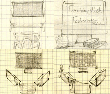
Four sketches for Teaching With Technology, a column that was eventually renamed TechEd. After several weeks of emailing and conversing over iChat, we went with the icon in the upper right-hand corner.
We were careful not to infringe upon Gary’s creative talents. We gave him some direction and left the rest up to him. After all, he was the artist! If we hadn’t let Gary do his own thing, we would have missed out on some amazing icons. Take our Macify column, for example. Everyone was at a complete loss for this column’s icon. Somehow, Gary came up with the idea for Super Mac Man, who can now be found on every Macify column.

Gary claims the Macify composite graphic (left) took him less time to build than sketch. The final Macify icon is shown on the right.
We initially worried that Macify would raise the ire of Apple’s Legal Department, but we decided to damn the torpedos and go with it. (So far, so good.) It was just too good of an icon to pass up!
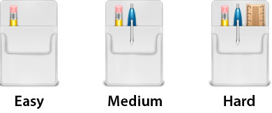
Perhaps the most difficult icons to decide upon were our tutorial gauges. We needed a way to rank the difficulty of our tutorials, and we wanted a really creative, effective way to show this. After a couple days of brainstorming, we came up with the following ideas:
- Thermometers: Easy tutorials are cold, medium tutorials are medium, and hard tutorials are hot.
- Traffic Lights: Green for easy, orange for medium, and red for hard.
- Karate Belts: White, orange and black belts, ala karate skill levels.
- Puzzles: A puzzle with 1 piece off to the side. Smaller pieces equate to harder.
- Aviation themes: Goggles for easy, old leather helmet and goggles for medium, and fighter pilot’s helmet and air mask for hard.
- Engineering Images: A manual and a circuit board, a circuit board and some tools, and oscilloscope.
In the end, we nixed all of these ideas for one volunteered by our own Ric Getter. Everyone agreed that using pocket protectors to indicate difficulty was a great idea!

While we’re not finished designing our icons, we’ve had a great time working with Gary, and we think we’ve scored some pretty cool icons. Look for new Macinstruct icons soon!
Tips for Those Looking to Have Icons Designed
I’m not an icon designer, and I never will be. My graphical abilities start and end with minor editing and formating in Adobe Photoshop. (To be honest, things are a little iffy even then!) I know there are a lot of us graphic n00bs out there, so here are some lessons I’ve learned over the past five months.
- Trust the Icon Designer: It won’t kill you! These people know what they’re doing, and they can help you if you let them. Listen to their ideas instead of shoving your ideas down their throats.
- Buyer Beware: Price is not always indicative of talent. When shopping for icon designers, the first thing you should examine is a set of sample icons. Take it from someone who looked: The most expensive designers are not the best. If you’re paying more than $500 for an icon, you’re probably paying too much.
- Search, and Search Again: You might start looking for icon designers by searching for, uh, “Mac icon designers.” But these aren’t the only people and organizations designing icons. Hit the major Mac icon websites and email the best individual icon designers. Many of them take on side jobs. Take your time looking if you want to find someone who fits your organization and project. Don’t get discouraged!
- Plan Ahead: It can take a full week to find an icon designer, and several weeks to have one icon designed. Start the process months before you need your icon. If you wait too long, you might be out of luck.
- Have Fun: Designing icons under deadlines can be stressful. Crack jokes, be nice, and tip your designer if possible.

Our volunteers love to kid around on Macinstruct’s mailing list, and Gary has quite a sense of humor. It keeps things fun - which is one essential icon design ingredient.
The bottom line is this: Having icons designed takes time, so start early. You don’t need to spend a fortune. Find a good designer that fits your organization and stick with him or her. Remember: Icon design is art, and you need to treat it as such.
Good luck!
Subscribe to our email newsletter
Sign up and get Macinstruct's tutorials delivered to your inbox. No spam, promise!